Xuyang Farm
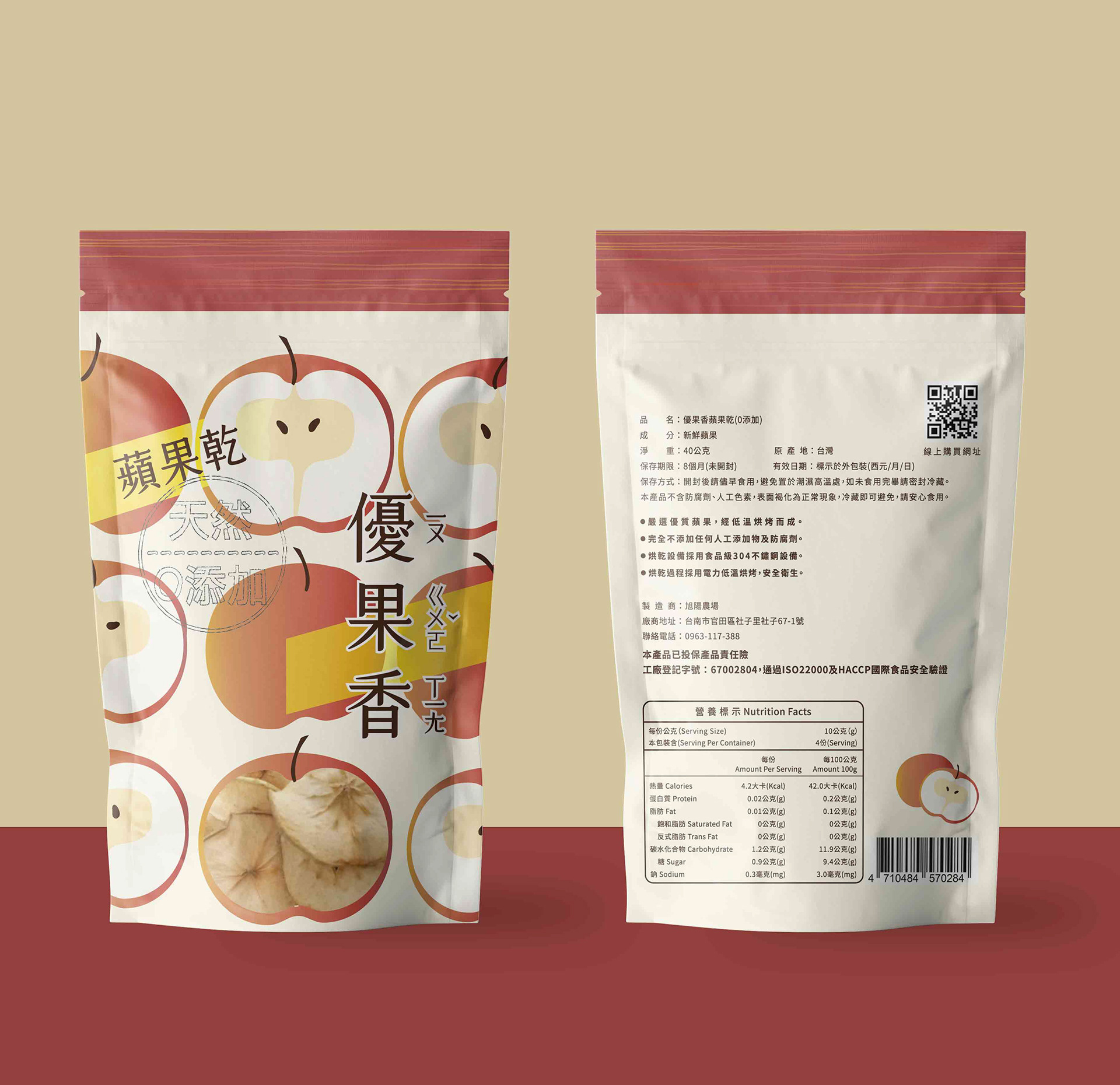
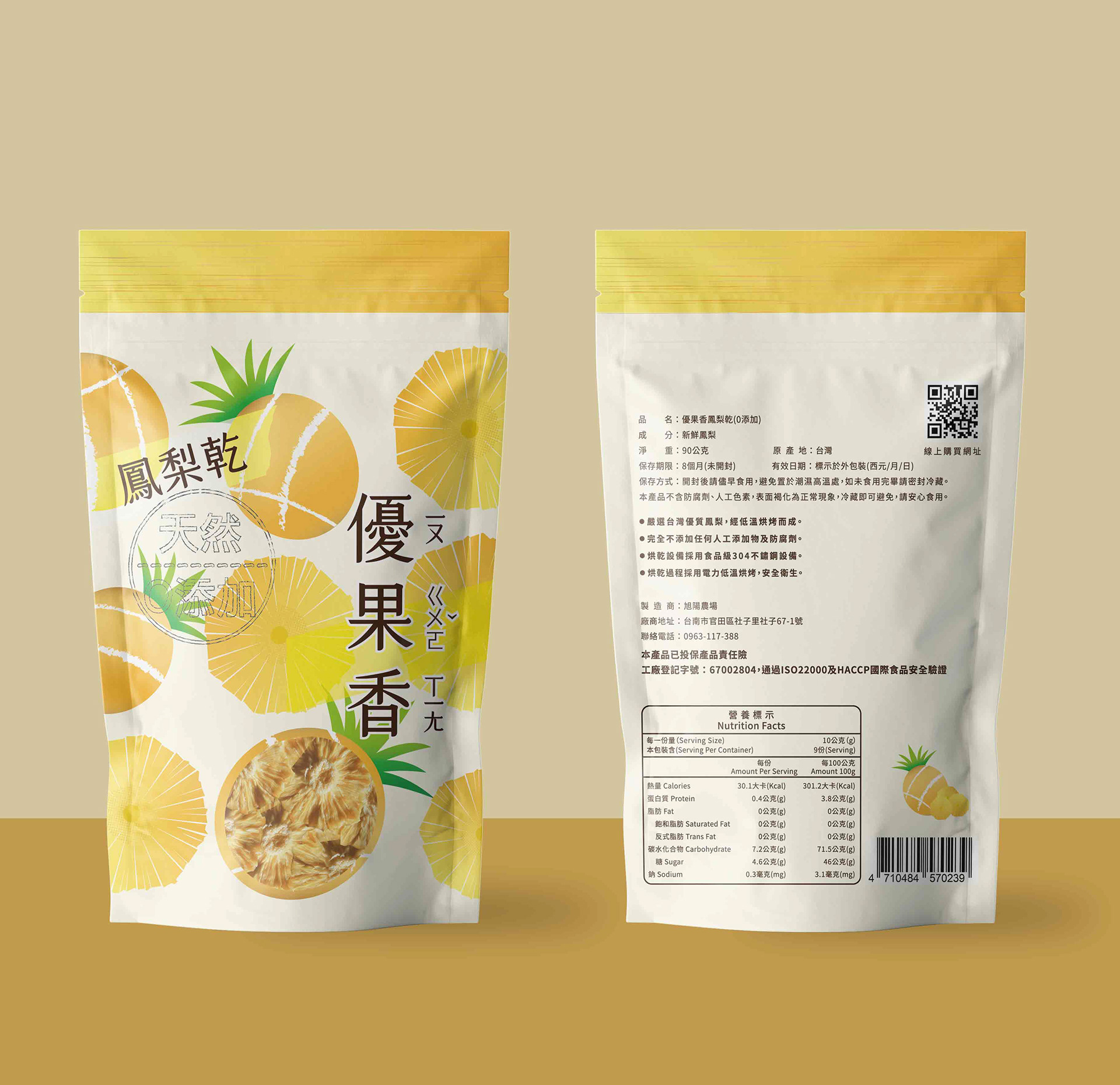
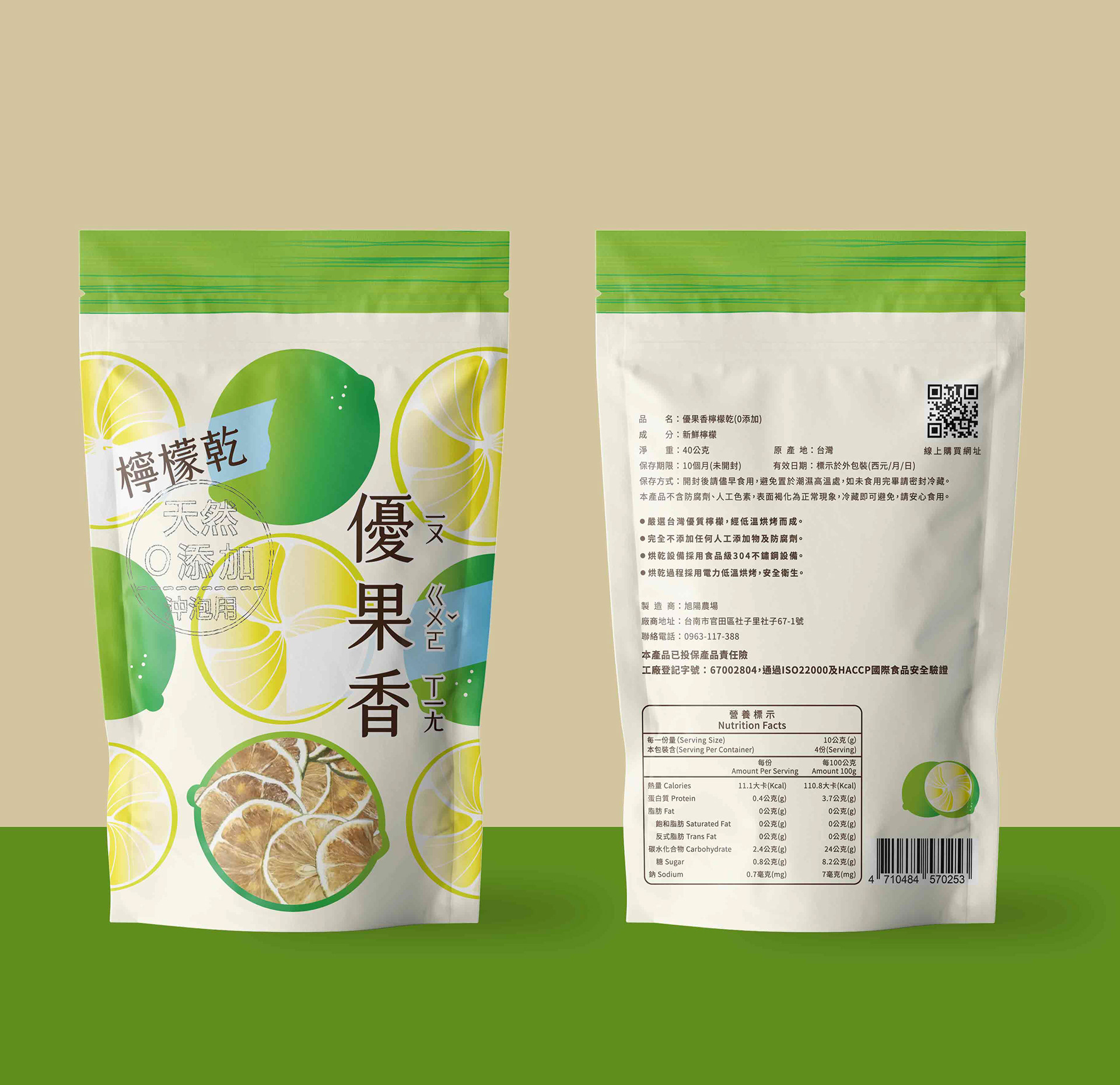
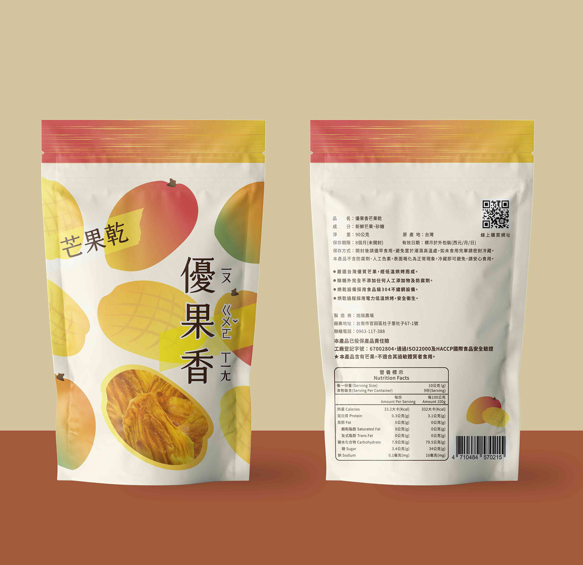
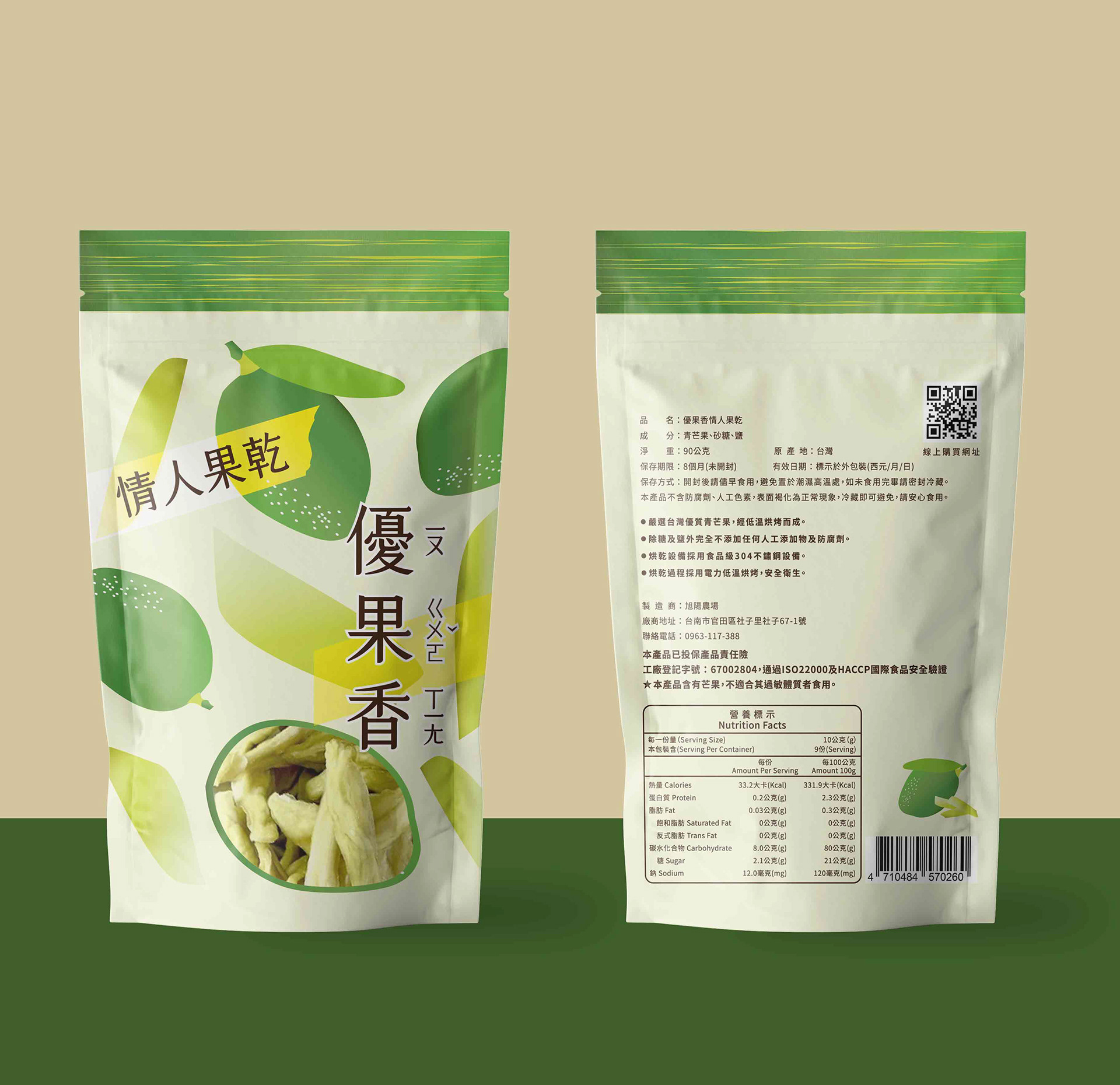
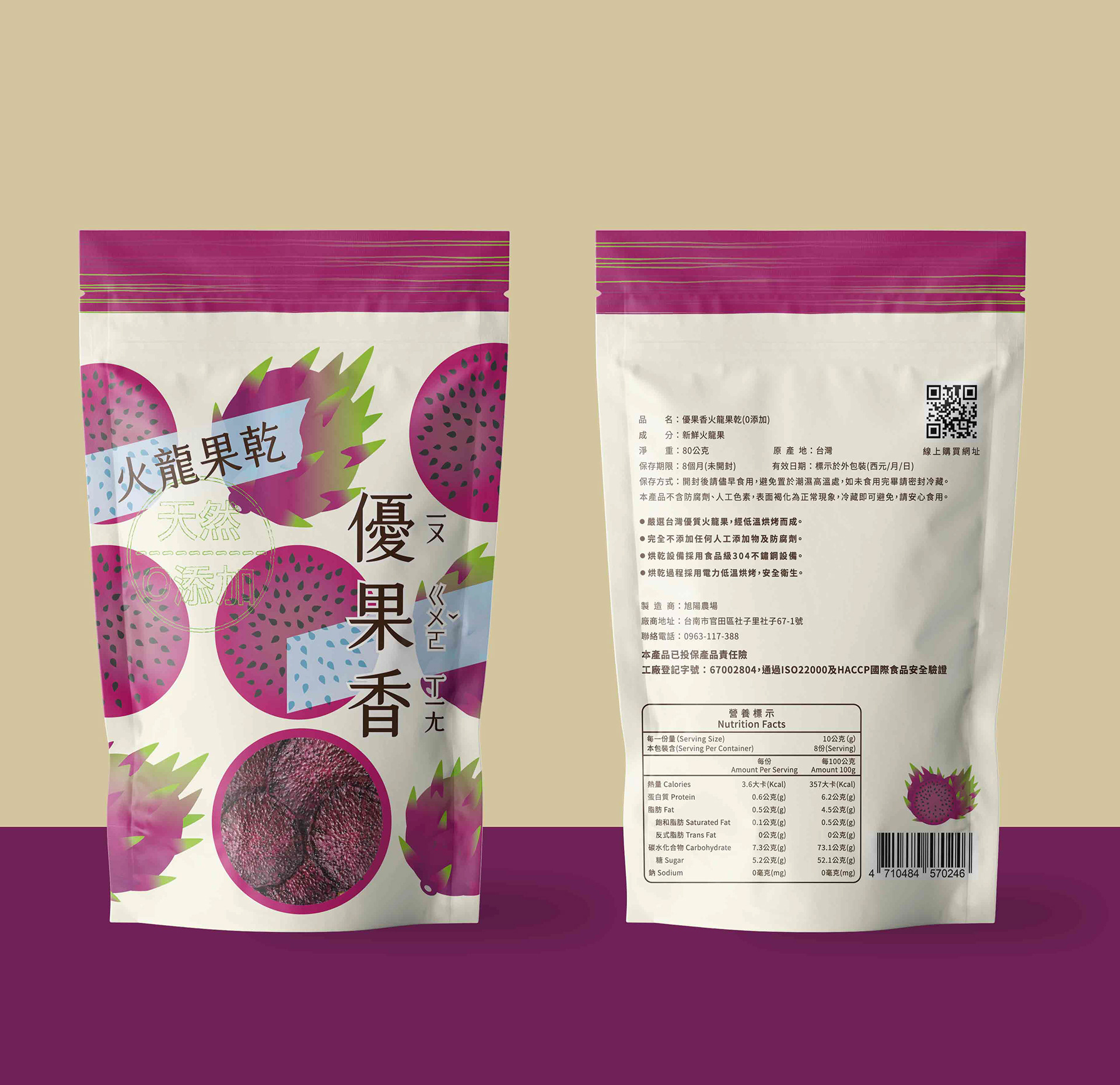
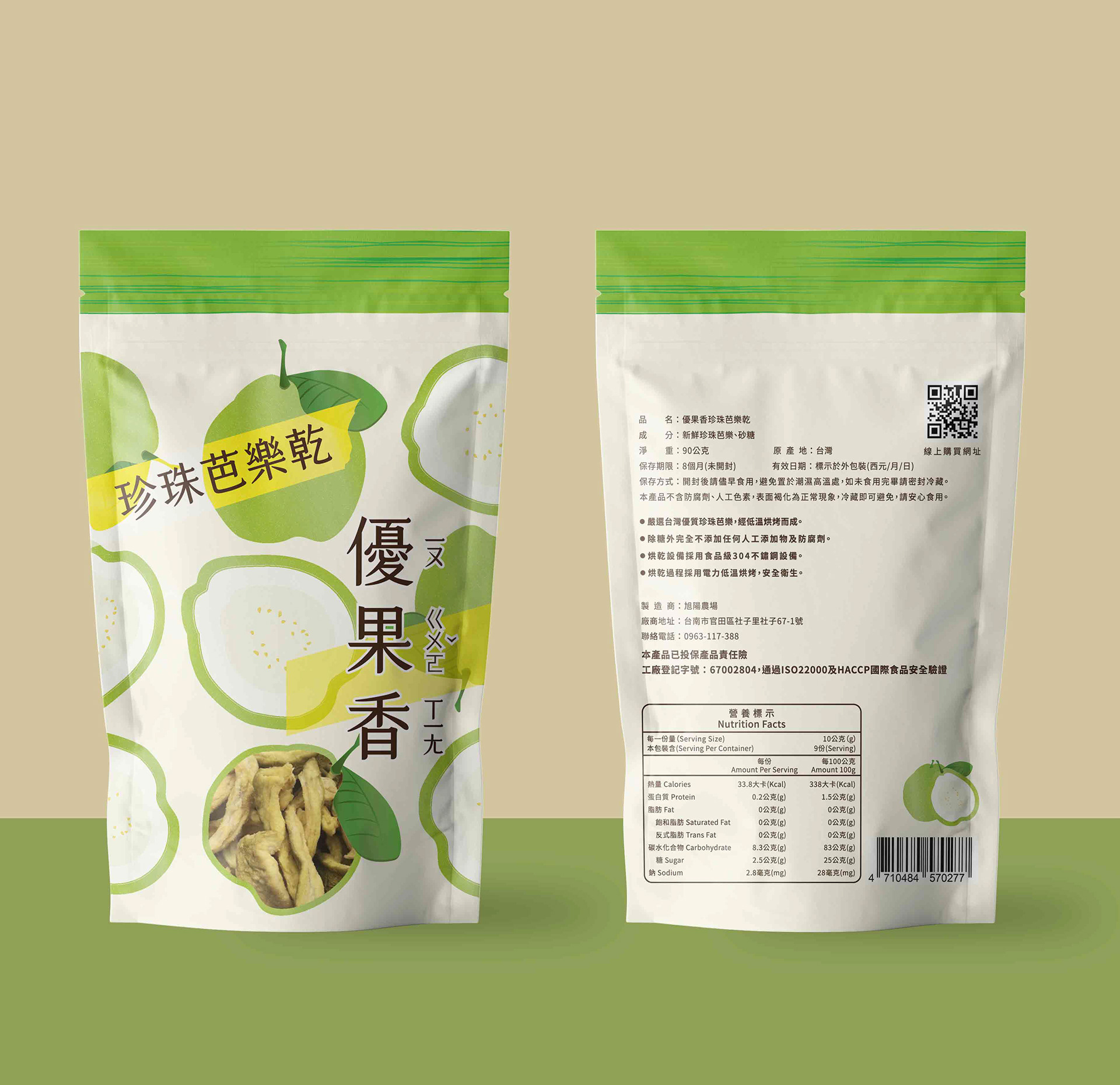
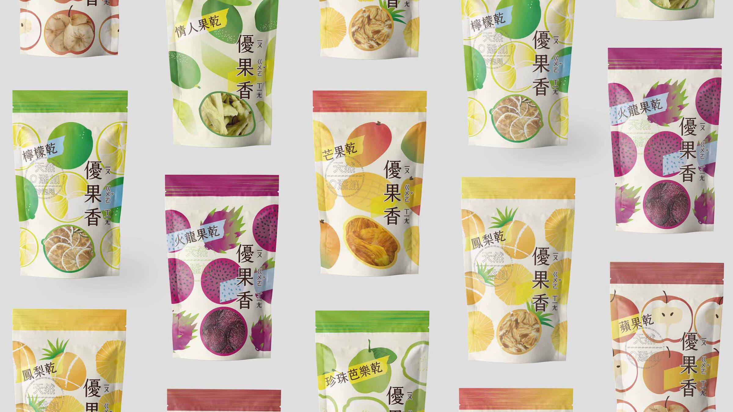
Rebranding of Xuyang Farm’s packaging, the visual identity draws inspiration from six featured dried fruits. Through hand-drawn food illustrations, both the exterior and interior textures of the fruits are captured, rendered in gradient colors that transition from unripe to ripe. Transparent windows on the packaging allow customers to see the freshness inside, as if experiencing the fruits’ journey of growth from the very first touch.
The vibrant, colorful palette reflects the brand’s vitality, like the rising sun of Xuyang, leaving a sunny impression on customers. After tasting the delicious products, they experience both surprise and joy, creating a double delight—visually and gastronomically.