Hei Bonn Co., Ltd.
Hei Bonn Gōrudohausu, a sub-brand under ordinary Co., Ltd., is a specialty “hardware store” dedicated to Japanese ingredients. Centered around five core offerings—Japanese and American beef, air-freighted live seafood, Japanese sake, wagashi, and imported condiments—the brand’s name is derived from the Japanese pronunciation Hei Bonn Gōrudohausu, playfully sounding like “ordinary golden house” in Chinese. Beyond its unique grocery selection, its signature service features customized ingredient purchasing paired with on-site cooking.
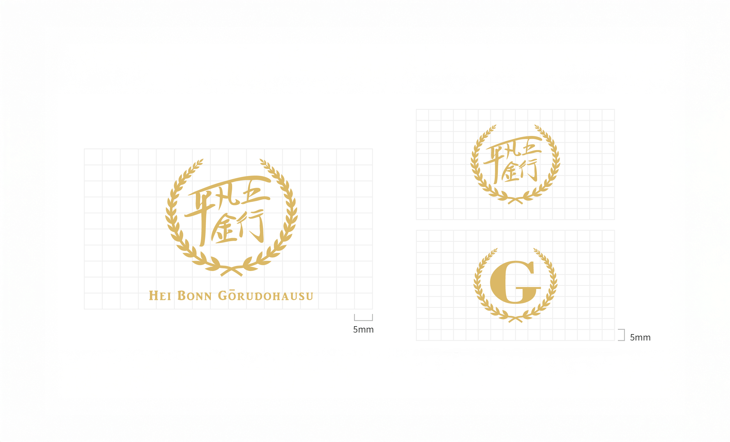
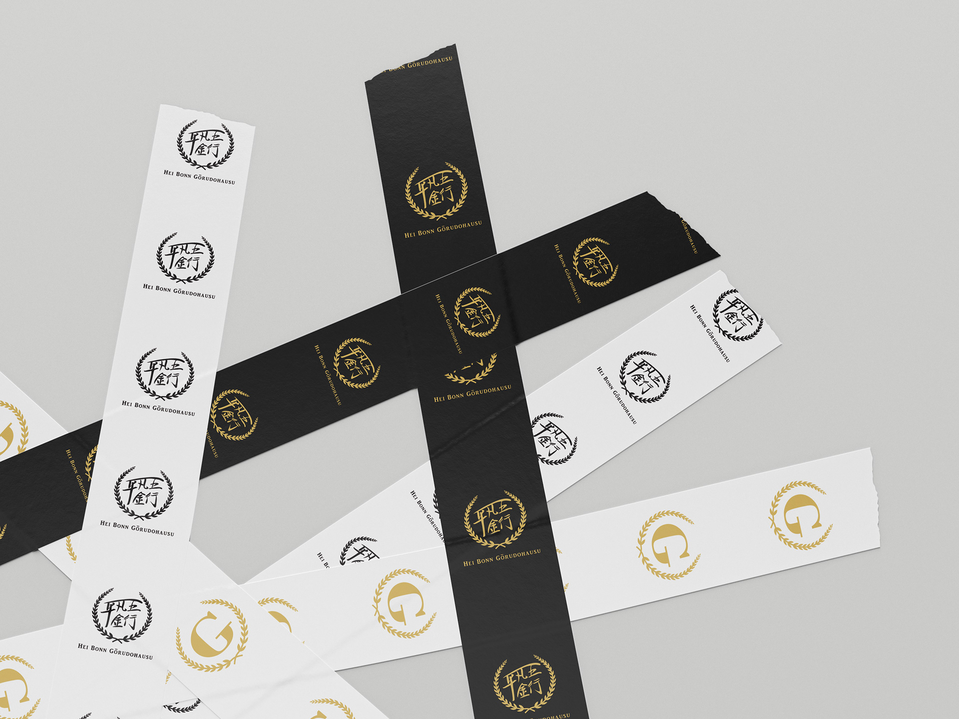
However, because the brand previously lacked a comprehensive brand identity system, its original logo featured the founder’s handwritten typography paired with an interlocking circular rice ear motif, while a secondary visual utilized the letter “G” combined with the same rice ear motif. As a result, subsequent product applications lacked consistency and standardized visual extension.
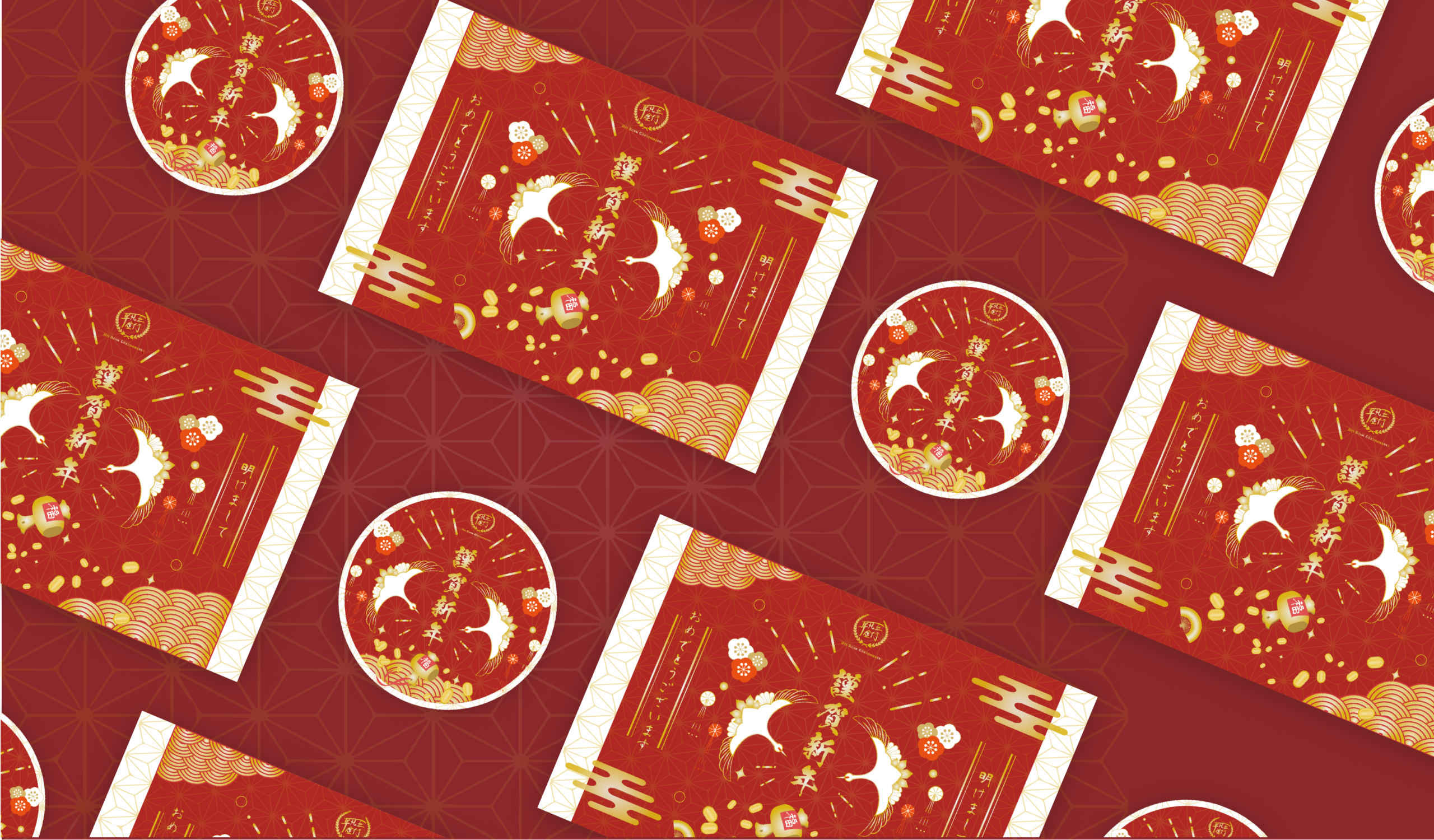
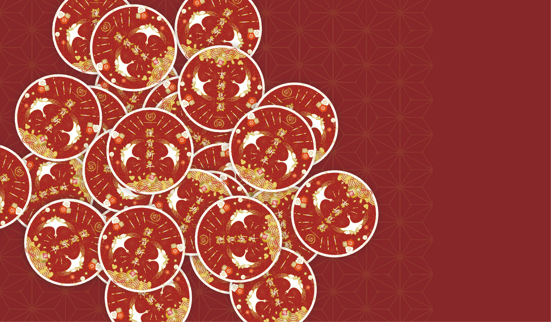
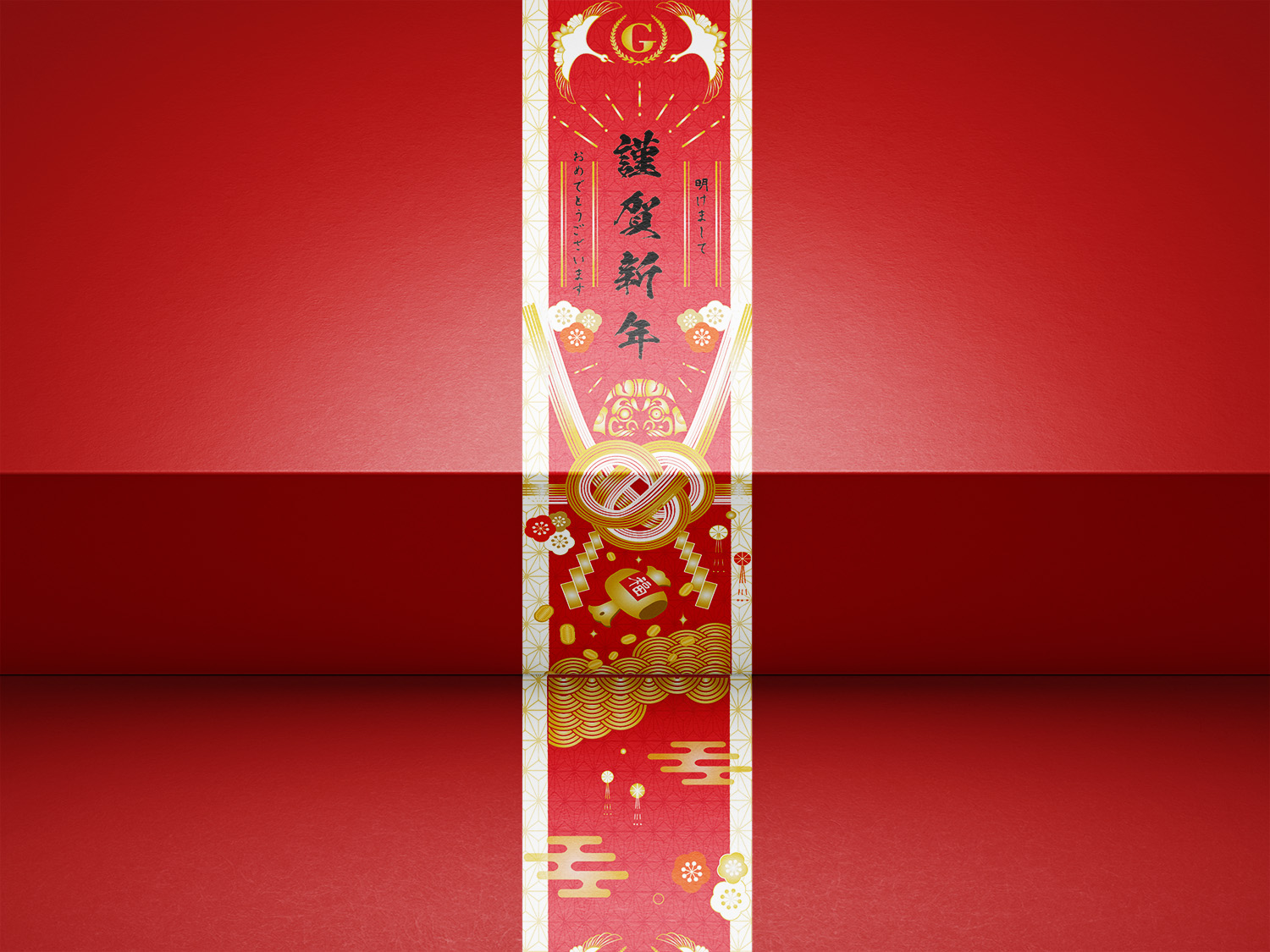
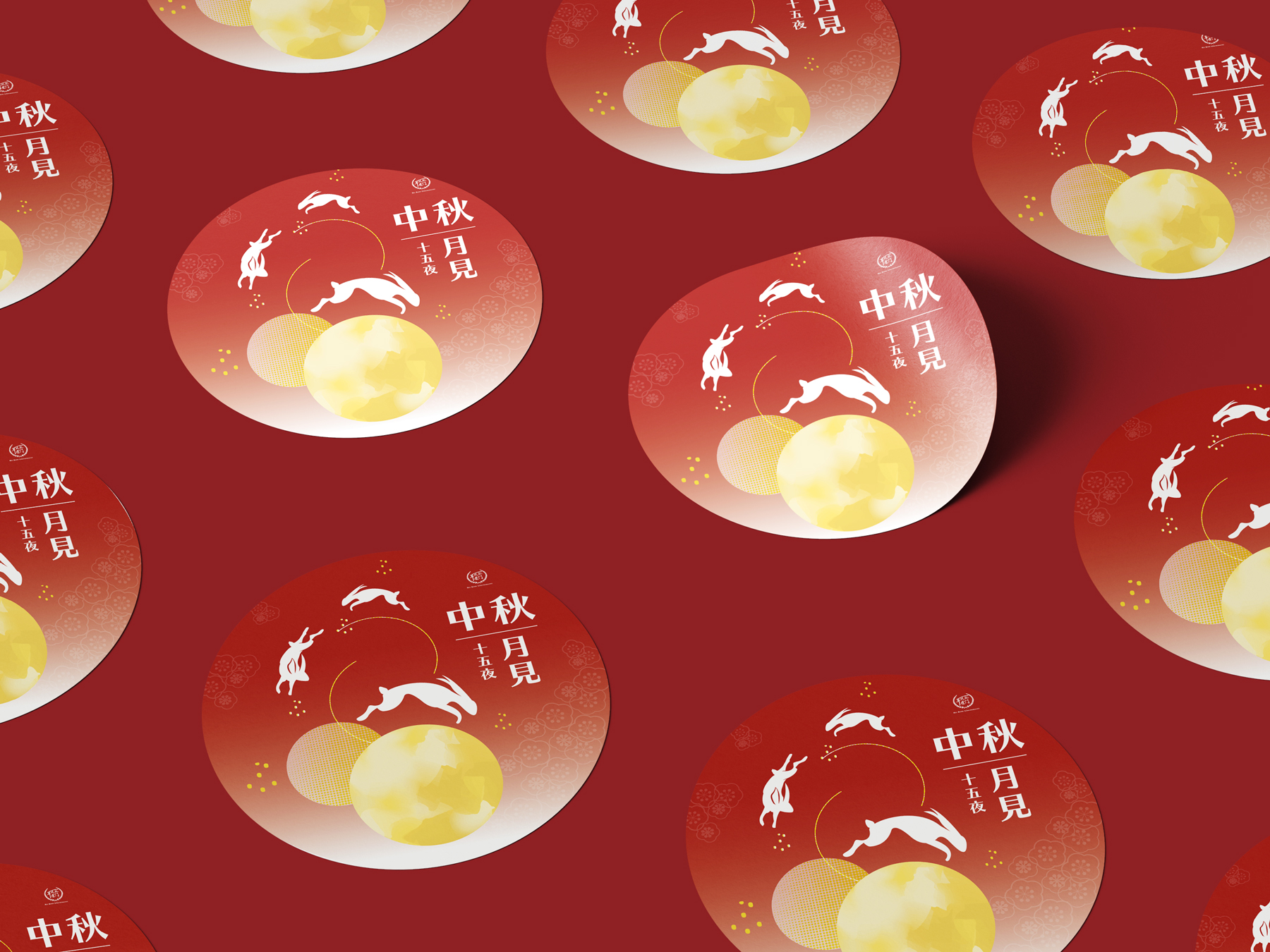
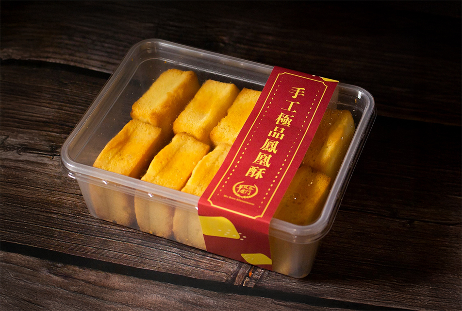
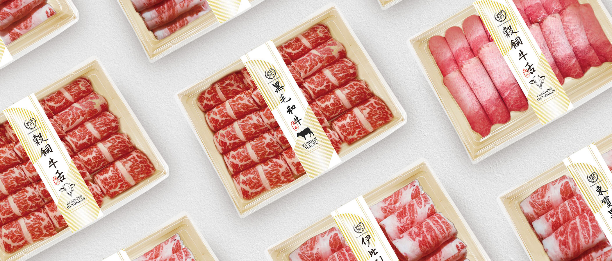
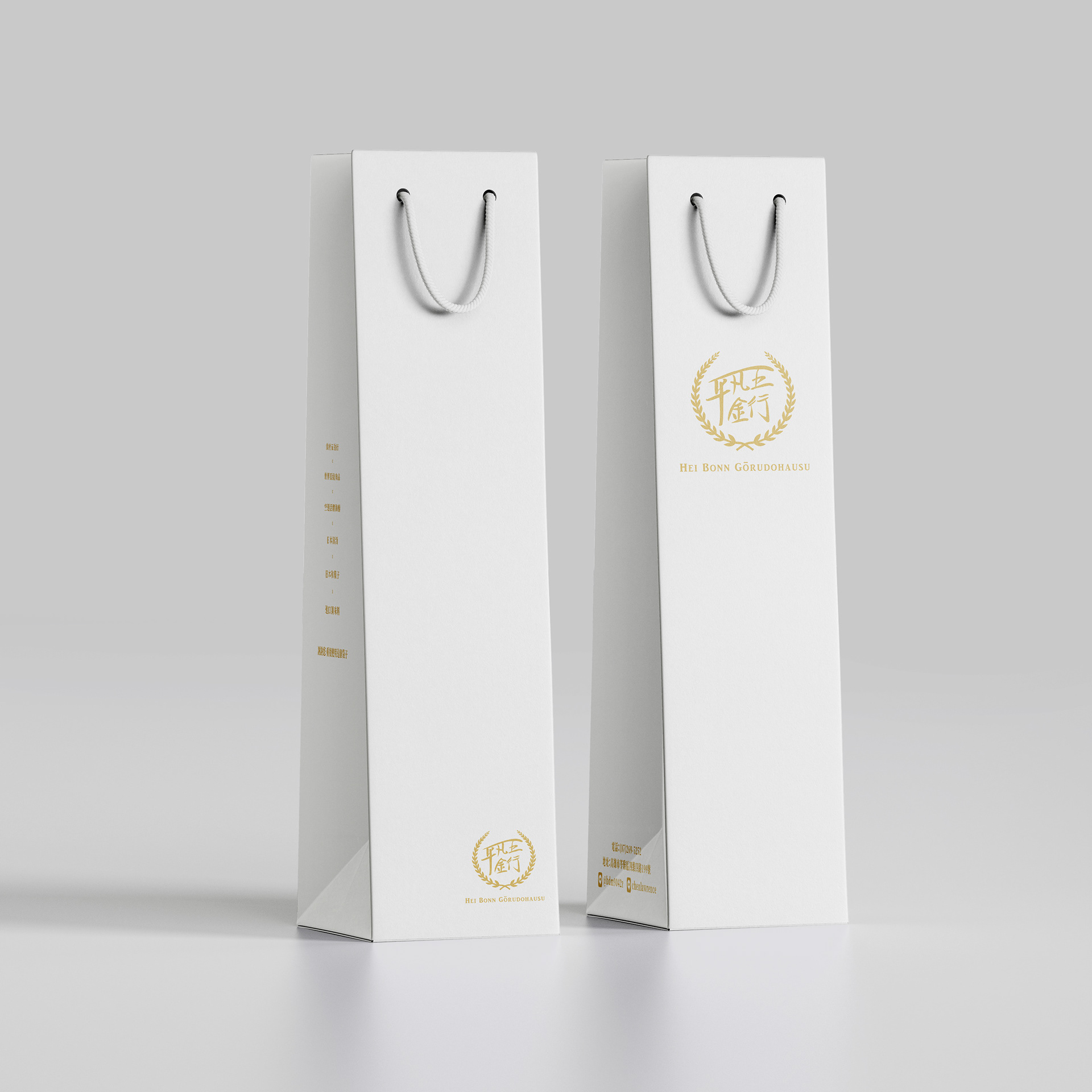
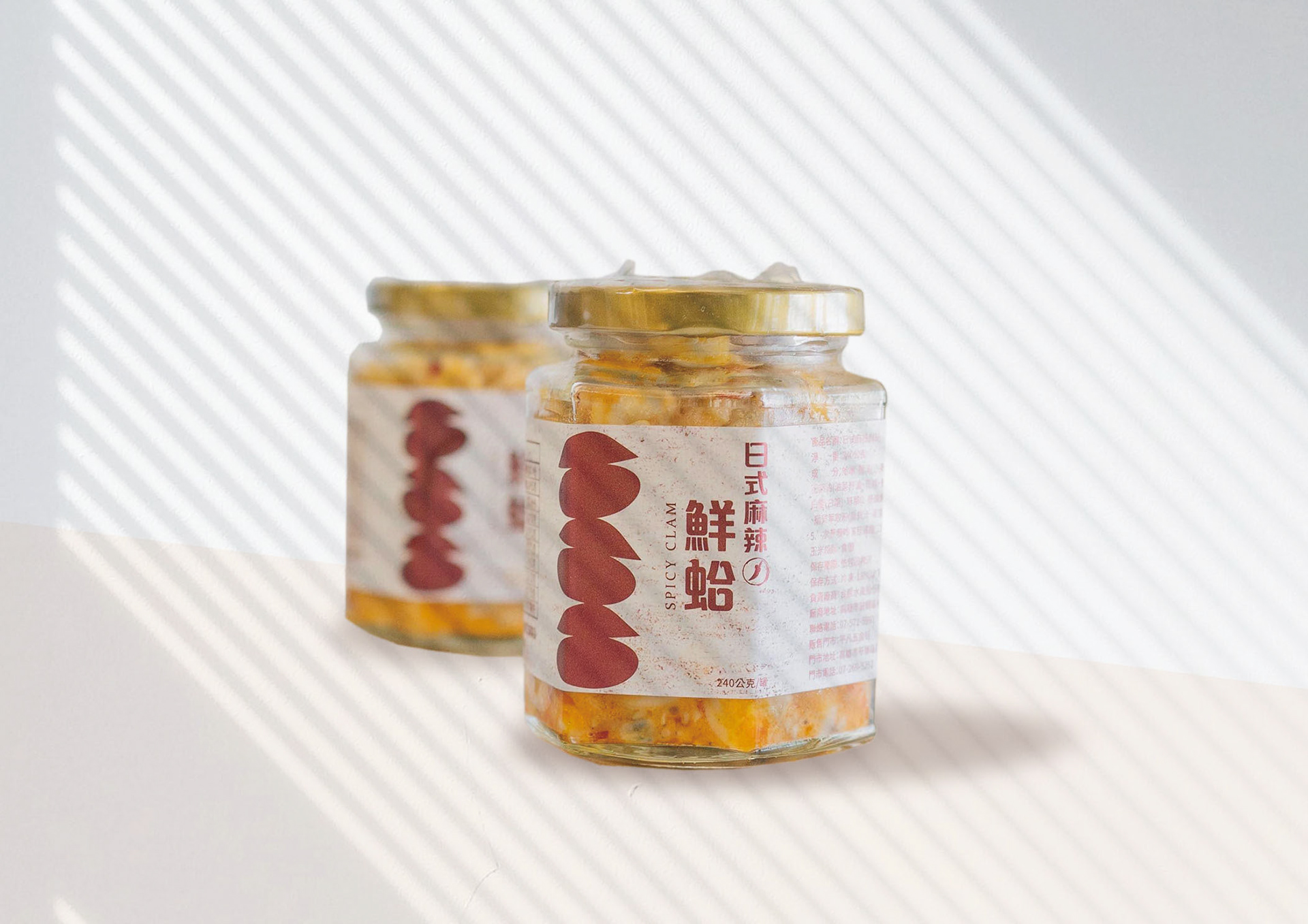
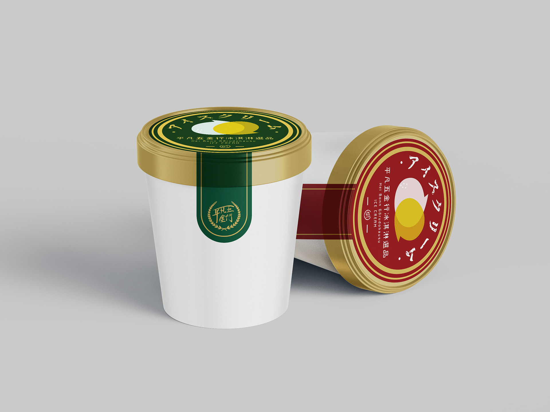
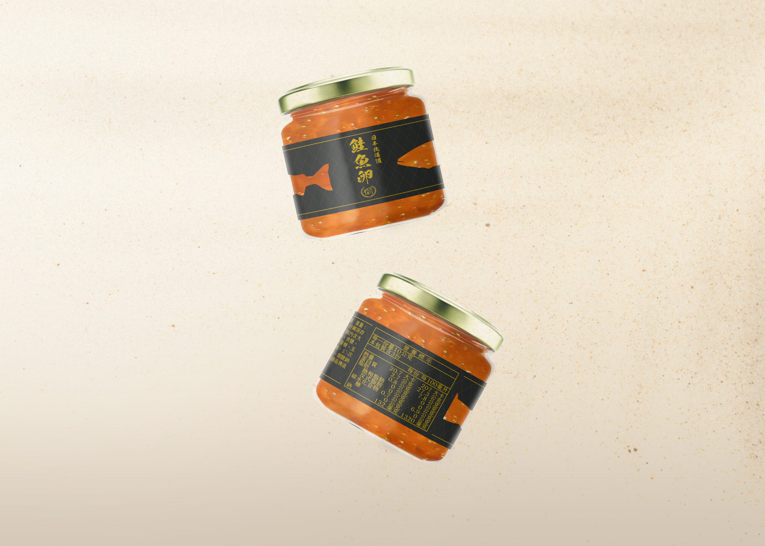
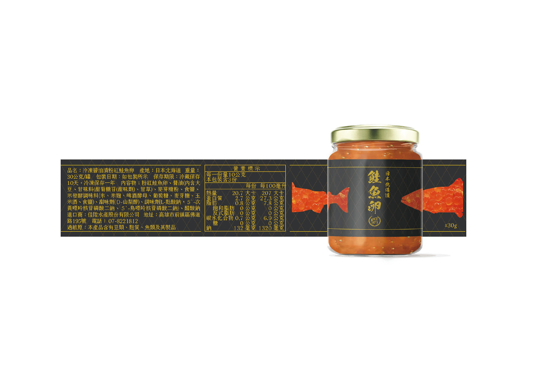
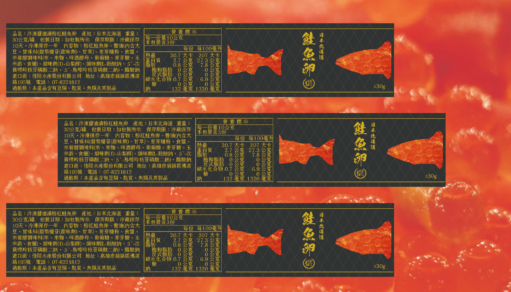
To strengthen the brand’s overall image, professional identity, and market differentiation, I assisted the company in developing a comprehensive visual identity (VI) system and handling trademark registration. By extracting standard colors and establishing standardized typography from the existing brand visuals, the new system was systematically applied across product packaging, commercial space wayfinding systems, and cross-platform digital marketing applications, including Facebook, Instagram, LINE, and Google Business Profile.
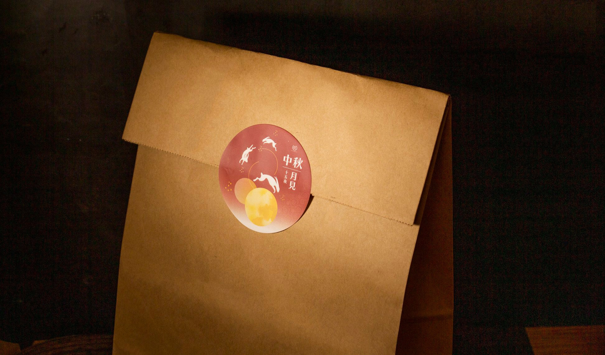
Festival-Related Design