

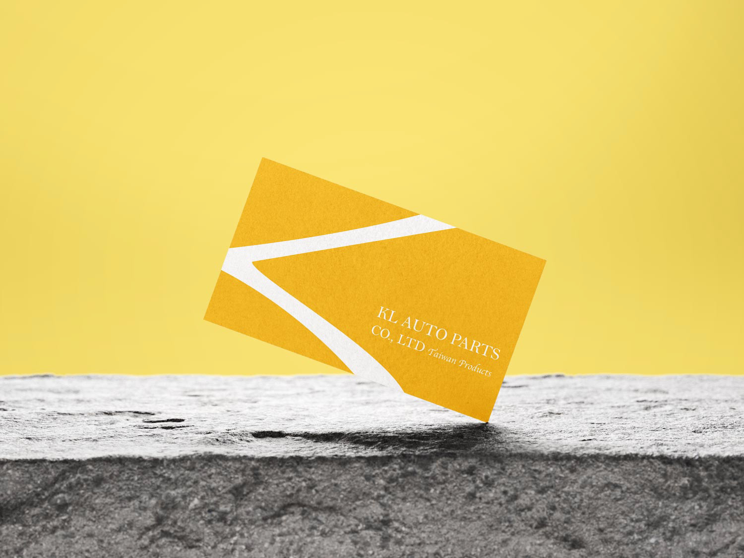
KL汽車零件公司 KL Auto Parts Co., Ltd
Founded by two young Taiwanese entrepreneurs who moved to Vietnam, the company brings high-quality Taiwanese auto parts into the local market.
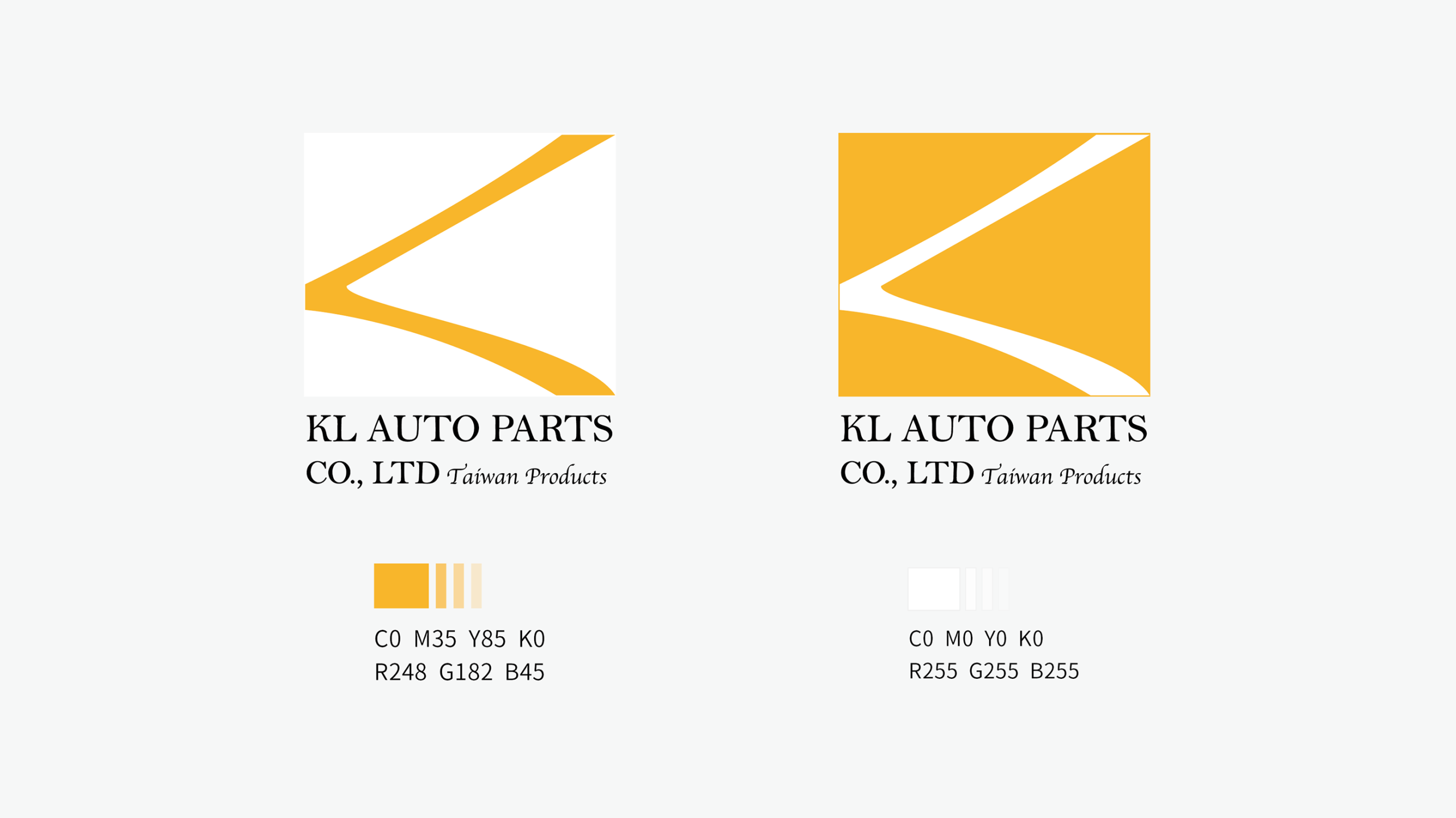
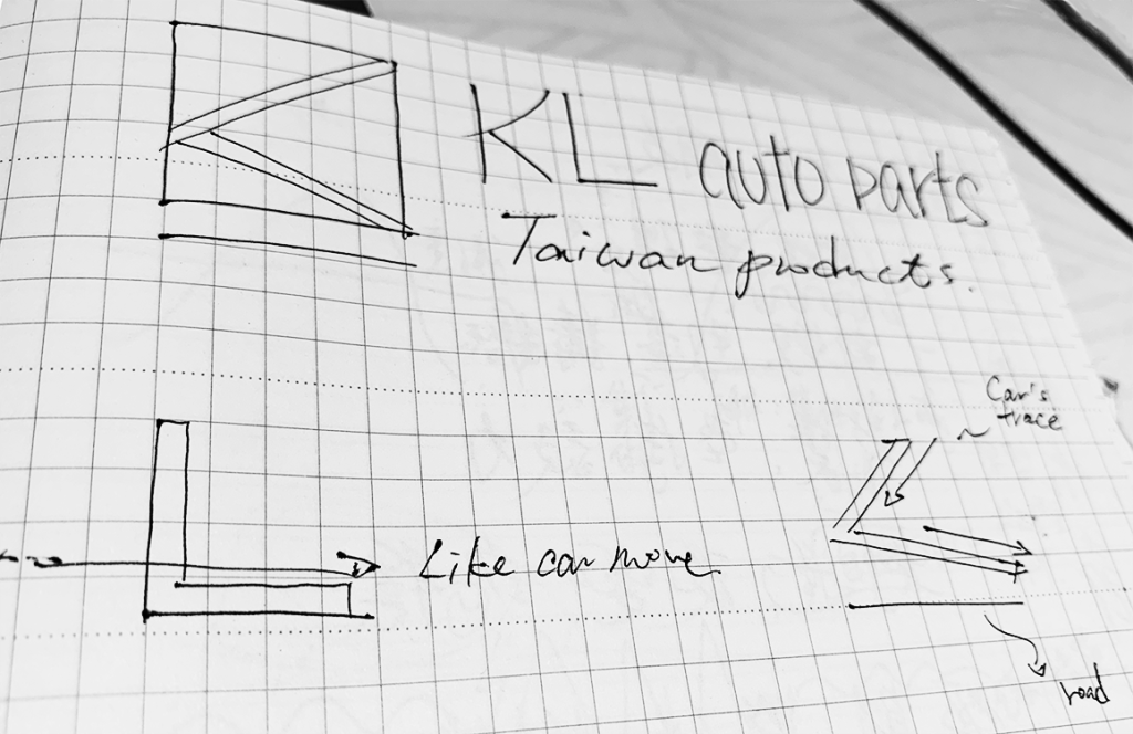
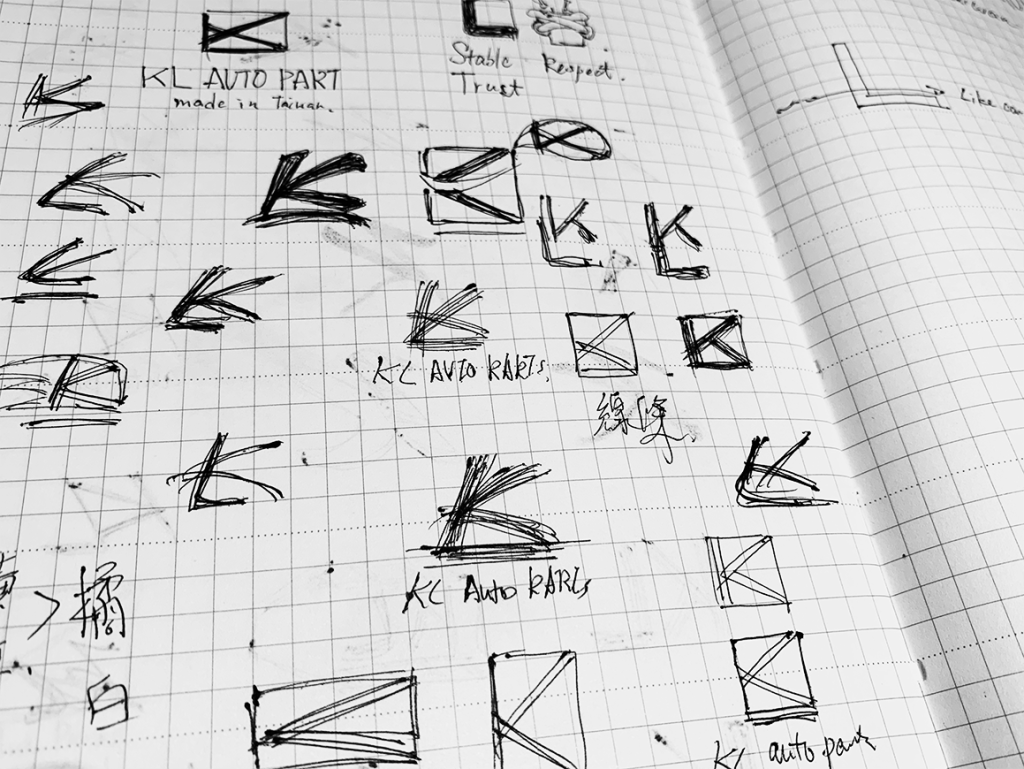
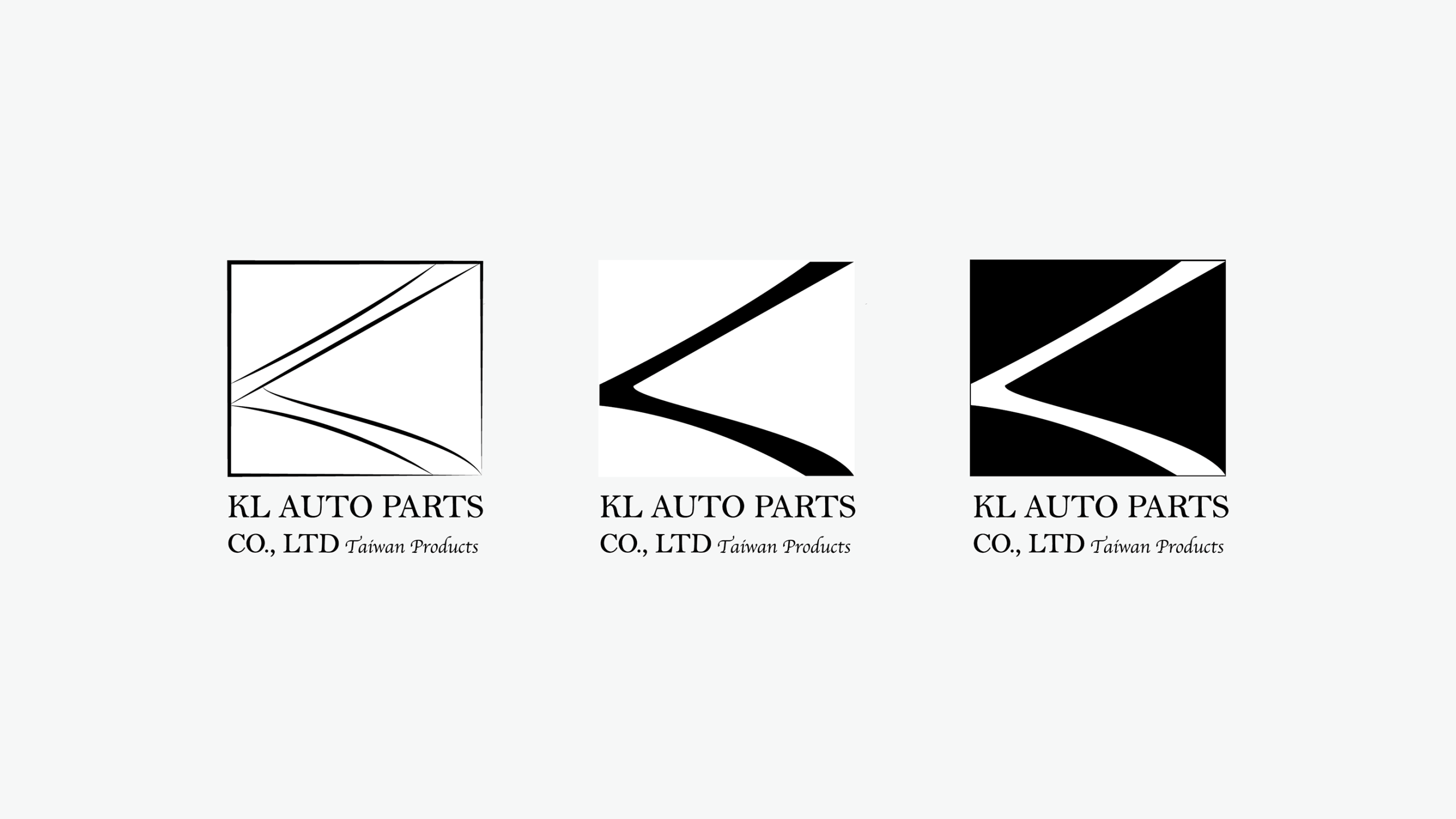
The brand name takes the initials of their names. The logo design blends three symbolic elements: the flowing gesture of calligraphy, the sense of smooth driving, and a traditional Vietnamese greeting (crossed arms in front of the chest as a sign of respect for elders). The imagery was simplified and refined into a unique brand mark.
Yellow and white were chosen as the main colors—yellow representing the cultural roots of Vietnam’s flag, and white symbolizing the sincerity and integrity of the two founders—together expressing respect, commitment, and seriousness as the brand enters the local market.
是兩位台灣年輕人離鄉至越南發展,以台灣優質的汽車零件為主要商品引進到當地市場。
品牌名稱取用兩人姓名的字母開頭,透過結合筆桿揮毫、行雲流水地駕駛,與越南習俗手勢(胸前交疊的雙手表示對長輩的敬重)三元素將圖像簡化、萃取成為品牌形象;主顏色黃與白的選取,則分別代表越南國旗的黃(表示該土地人文),代表兩位年輕人一片踏實與真誠的白淨,希望代表該品牌前進當地市場飽含尊敬與認真對待的精神。
–
Type Logo design
Client KL Auto Parts Co., Ltd
Designer Adeiv Tsai
Year 2021
分類 包裝設計
客戶 KL Auto Parts Co., Ltd
設計師 Adeiv Tsai
年份 Apr. – May. 2023
Client KL Auto Parts Co., Ltd
Location Kaohsiung, Taiwan
Logo Designer Adeiv Tsai
Namecard Designer Adeiv Tsai