

風車驛站 Rebranding Design
Windmill Station is a sub-brand of Hei Bonn Gōrudohausu, located in Qijin, Kaohsiung, right next to the well-known tourist attraction Windmill Park. Originally, it operated for ten years as a popular garden-style seafood restaurant, highly appreciated by both local residents and tourists.
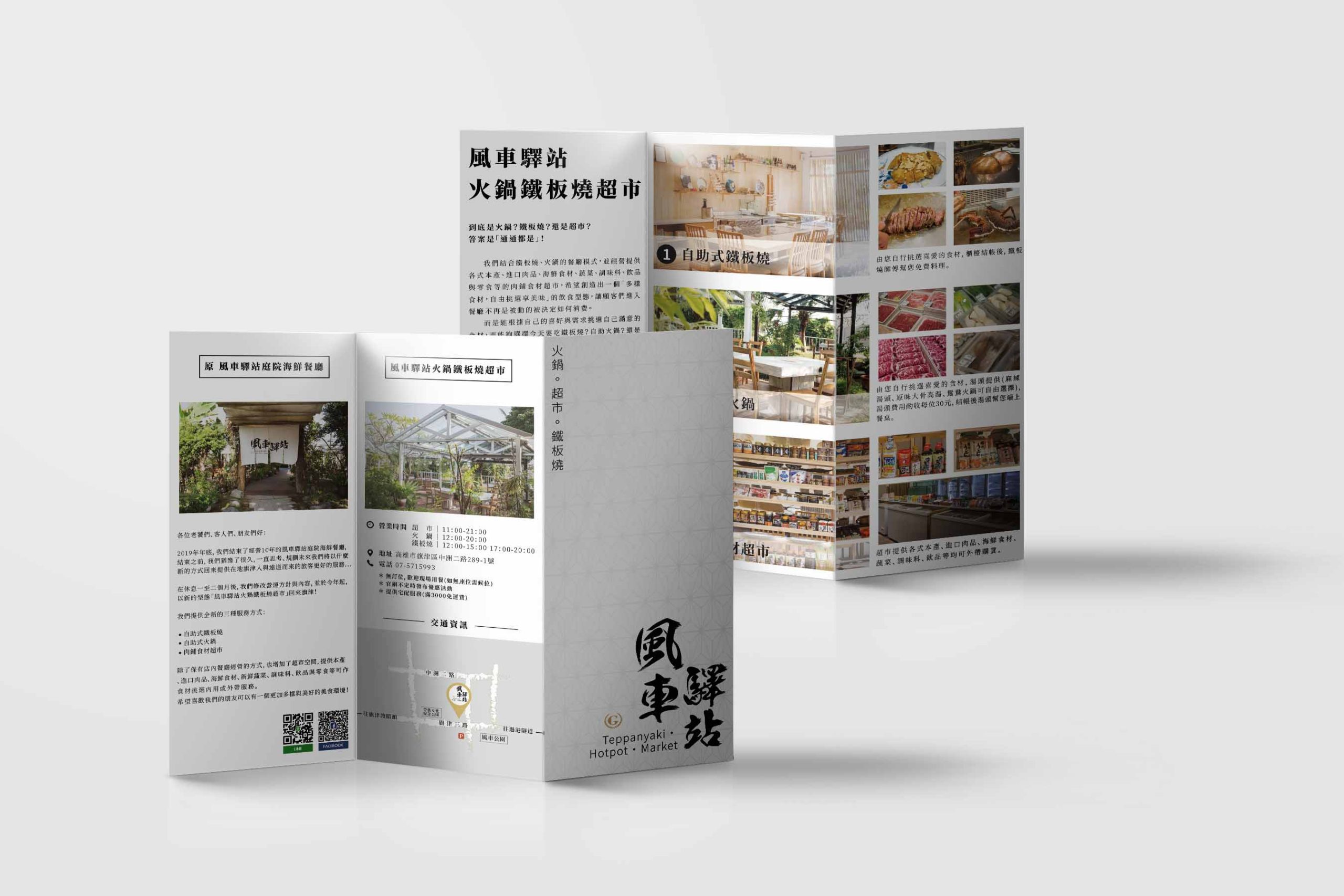
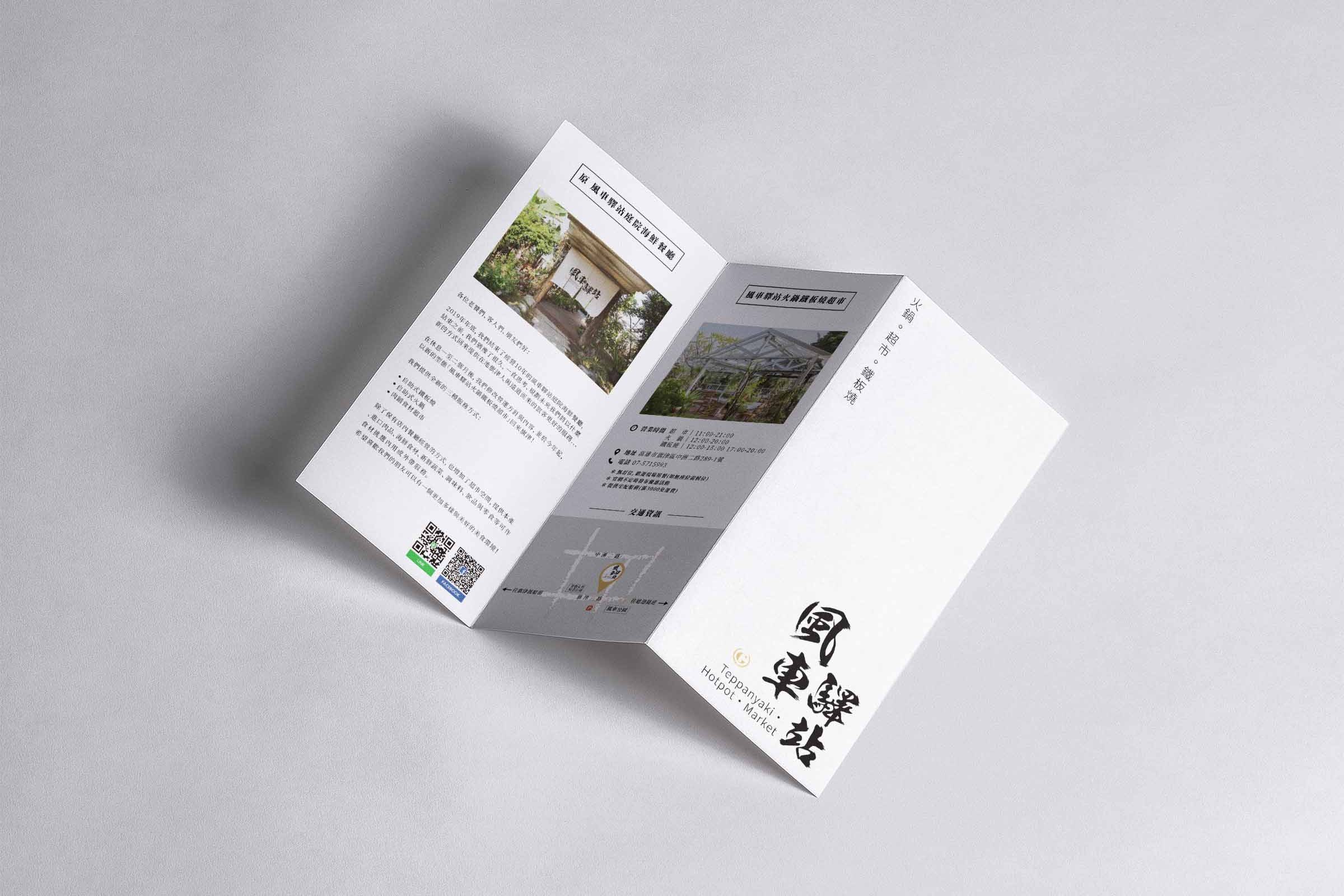
At the end of 2019, the owner decided to close the original business model and plan a completely new direction for the following year. The new concept brings together three services in one: teppanyaki, self-service hotpot, and a butcher-style food market, while retaining the well-known brand name. The brand identity was updated, in order to create a fresh image and offer a new dining experience to both existing and new customers.
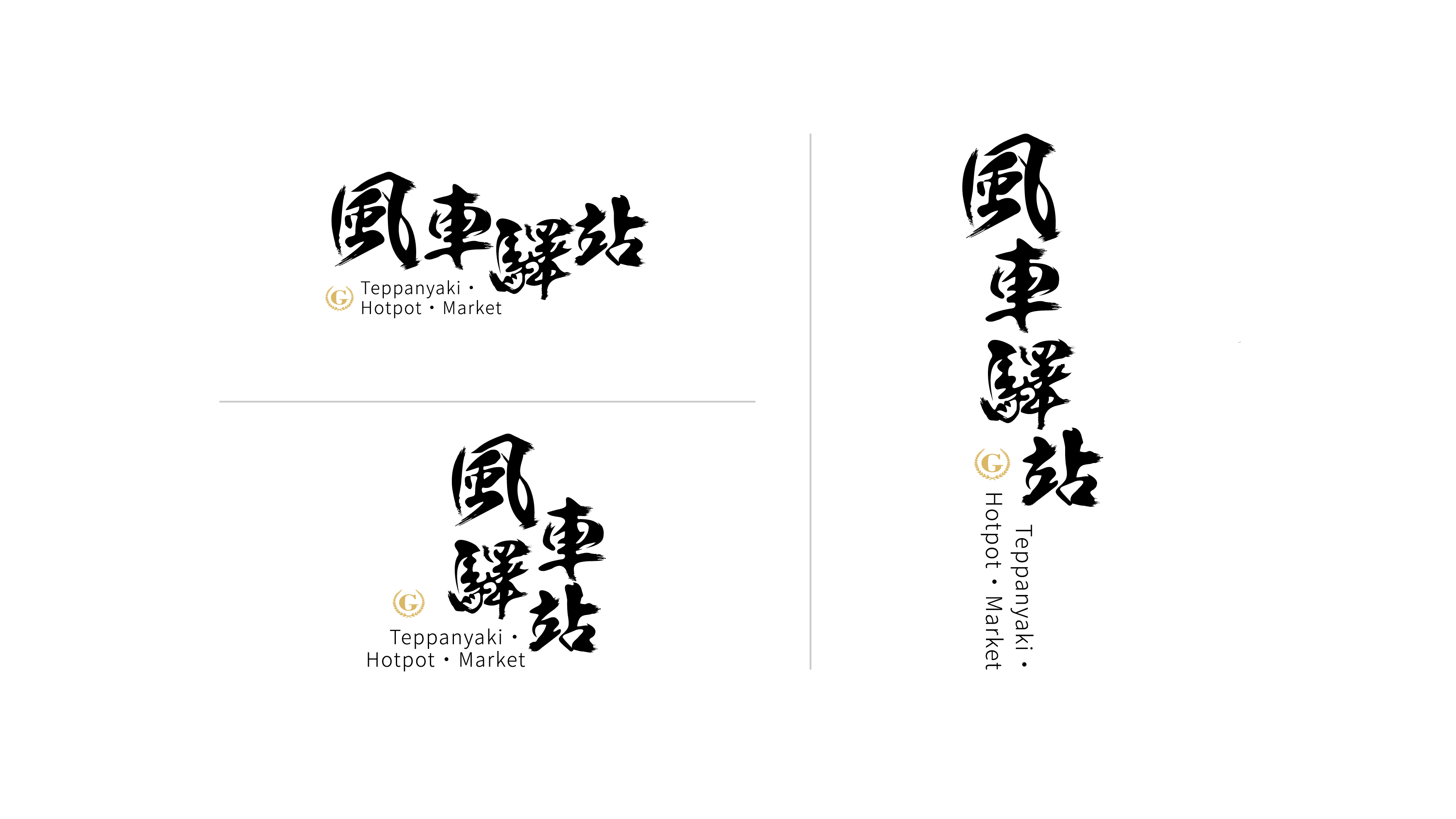
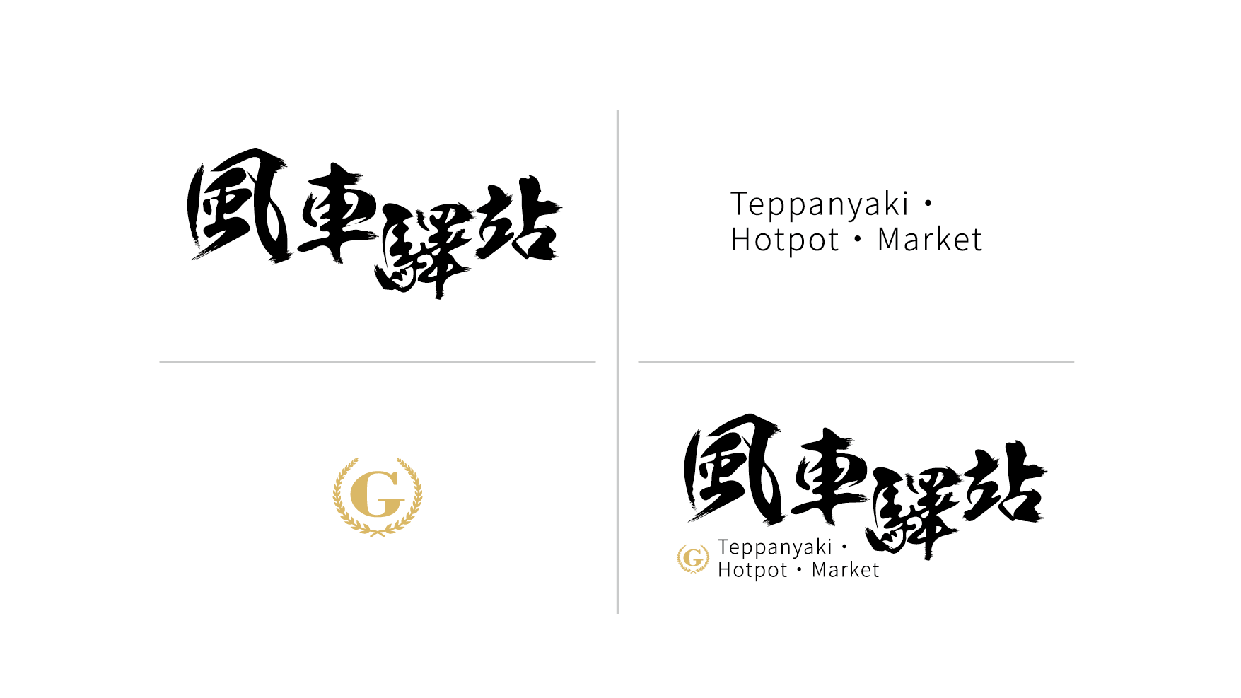
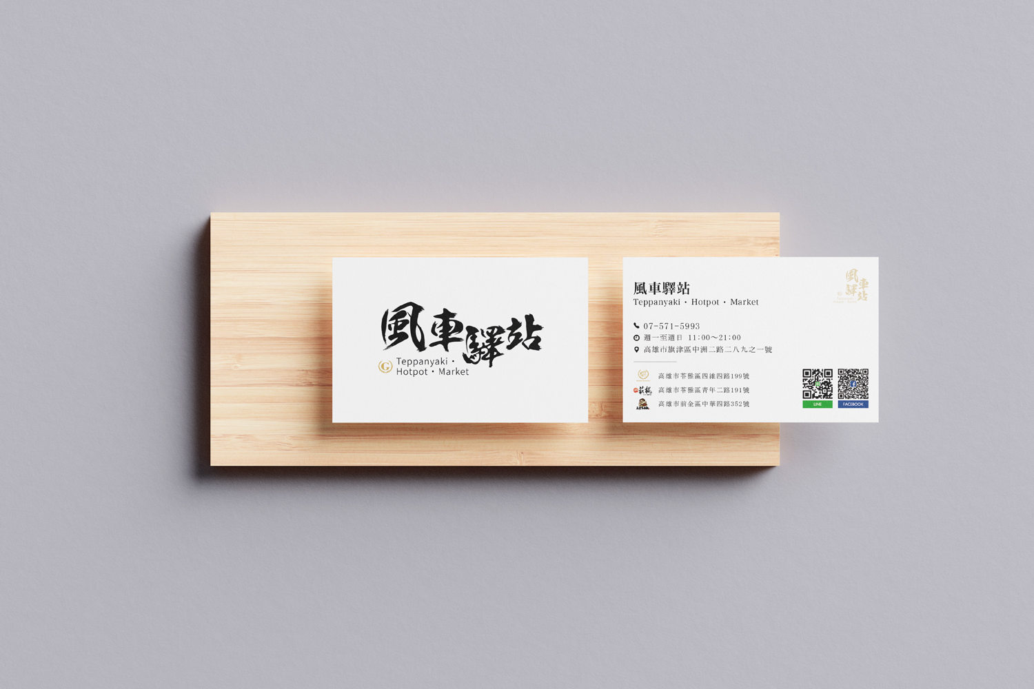
The new brand identity was inspired by the idea of “wind” from Windmill Park, combined with the chef’s swirling motion when cooking teppanyaki. It also keeps the hand-written calligraphic style that the owner has always liked. The fluent and energetic movements of the chef are translated into an image as free and smooth as the wind. Elements of Feibai (the visible brush texture in Chinese calligraphy) are exaggerated as decorative details, giving the entire visual identity a strong sense of dynamism, symbolising the constant flow of people and traffic.
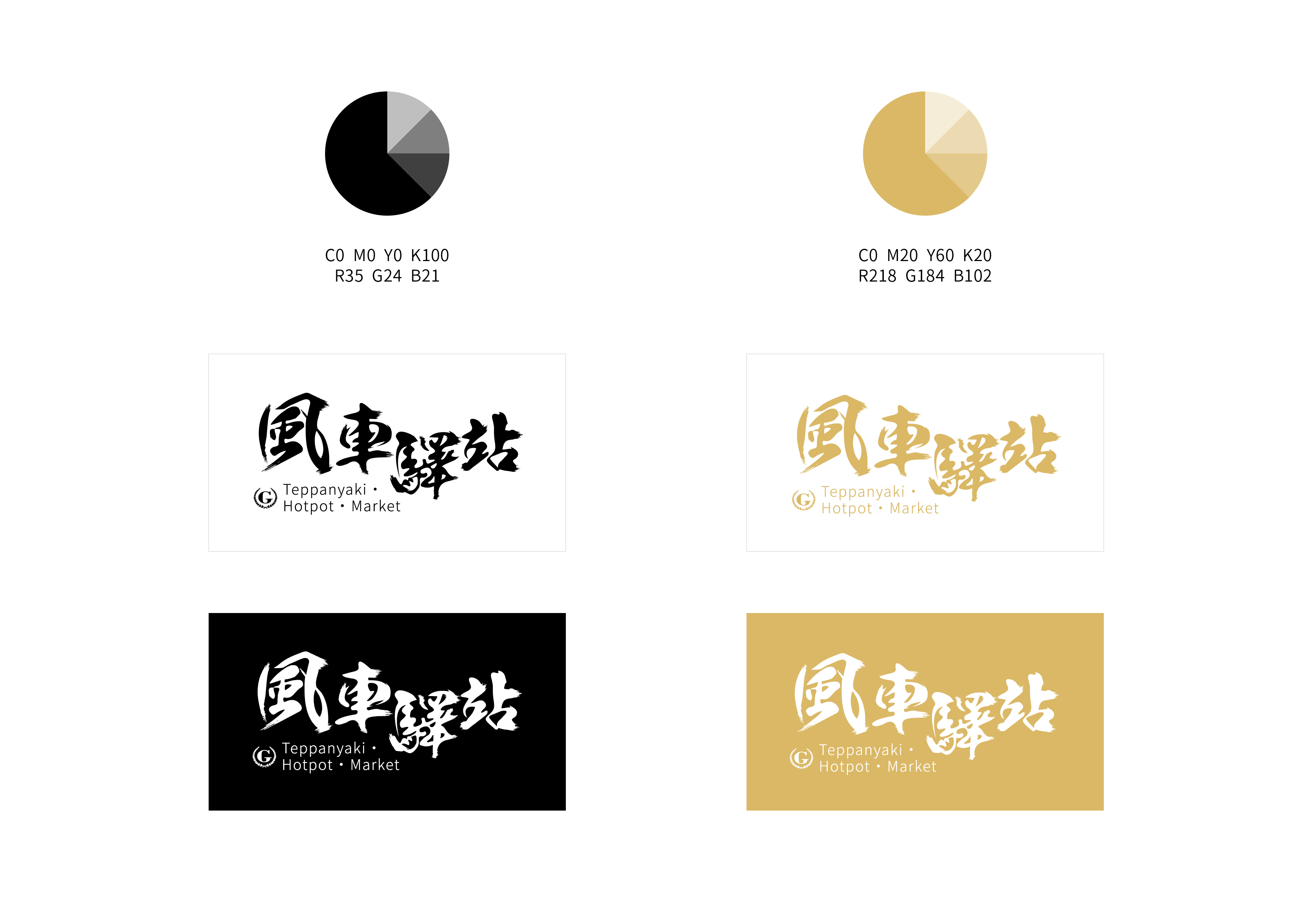
Since Windmill Station is a sub-brand of Hei Bonn Gōrudohausu, it not only highlights its own core products and services, but also incorporates certain items from the mother brand, acting as an extension and representative of the main brand. Therefore, the design intentionally includes subtle references to the mother brand, such as the colour palette and the use of a few graphic elements.
風車驛站,為平凡五金行的分支品牌,座落於高雄旗津旅客來往鄰近觀光景點——風車公園的邊上,是一間經營了十年,受在地居民與觀光客喜愛的「庭園海鮮餐廳」。2019年年底,經營者結束了原來的經營模式,規劃隔年以全新的營運面貌,結合「鐵板燒」、「自助式火鍋」、「肉鋪食材超市」三位一體的服務方式,沿用老字號的品牌名稱,將識別形象做一番更新,嘗試以嶄新的樣貌提供給老客戶與新客戶不一樣的用餐體驗。 新的品牌形象設計,是以風車公園的「風」、鐵板廚師「炒」的動作作為靈感連結的發想,並保留了業主原本即喜愛的書法體手寫風格,將廚師靈活俐落的料理動作宛如風一般流暢無阻的專業形象放入,並提取書法字體中的飛白做出一些誇張的裝飾表現,讓整個品牌形象呈現出一種動態感,表示人或車潮絡繹不絕的到來。另外,由於是風車驛站是平凡五金行的分支品牌,除了自己本身的主打商品與服務之外,還提供主品牌的商品,以期作為母品牌的形象分身建置與延伸,因此在設計上有相互呼應的小巧思,如標準顏色的配置和部分圖形元素的借用等等。
–
Category Branding
Designer Adeiv Tsai
Year 2020
分類 品牌設計
設計師 Adeiv Tsai
年份 2020