
旭陽農場 Xuyang Farm
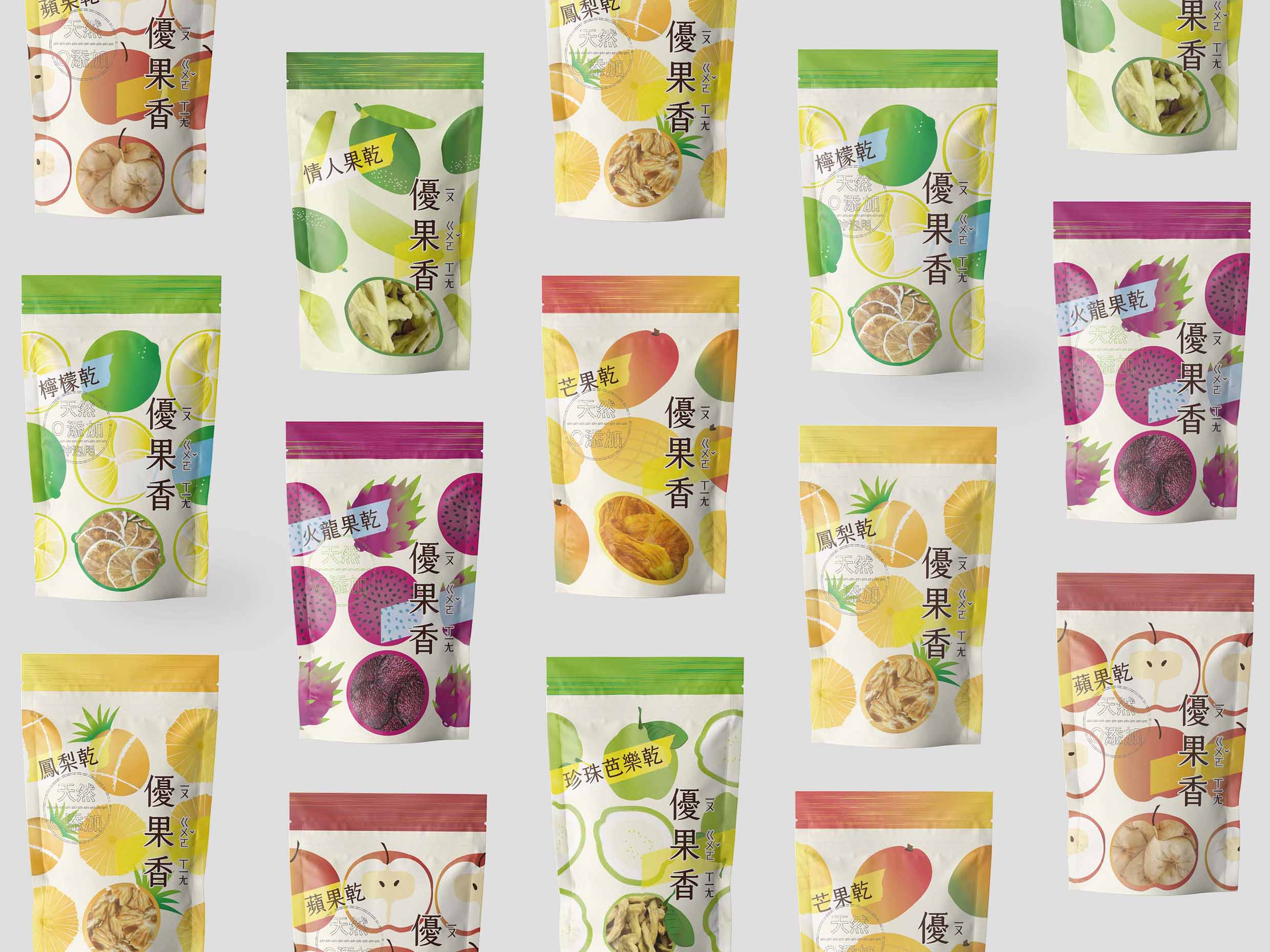
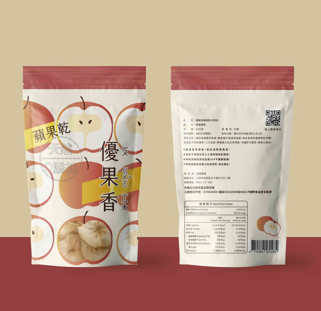
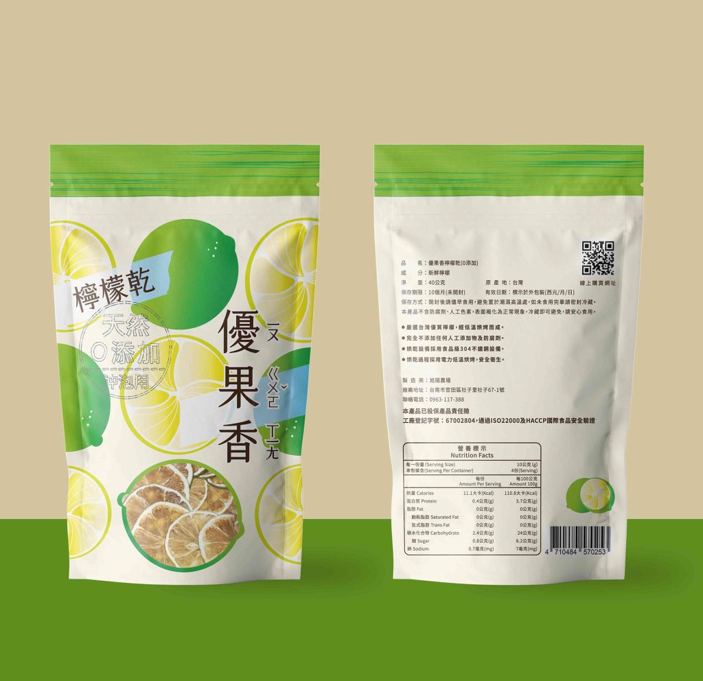
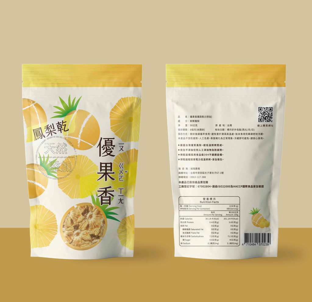
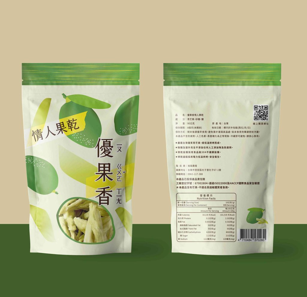
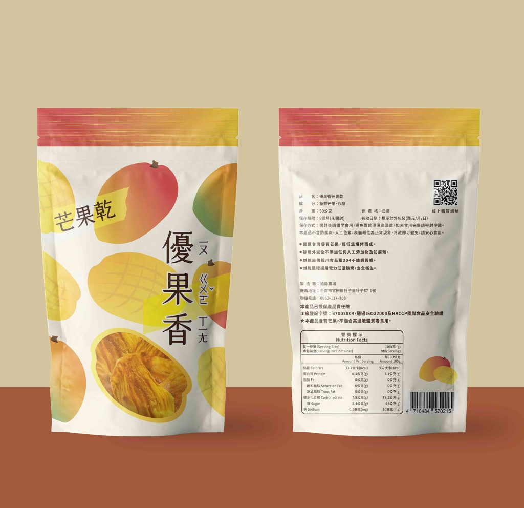
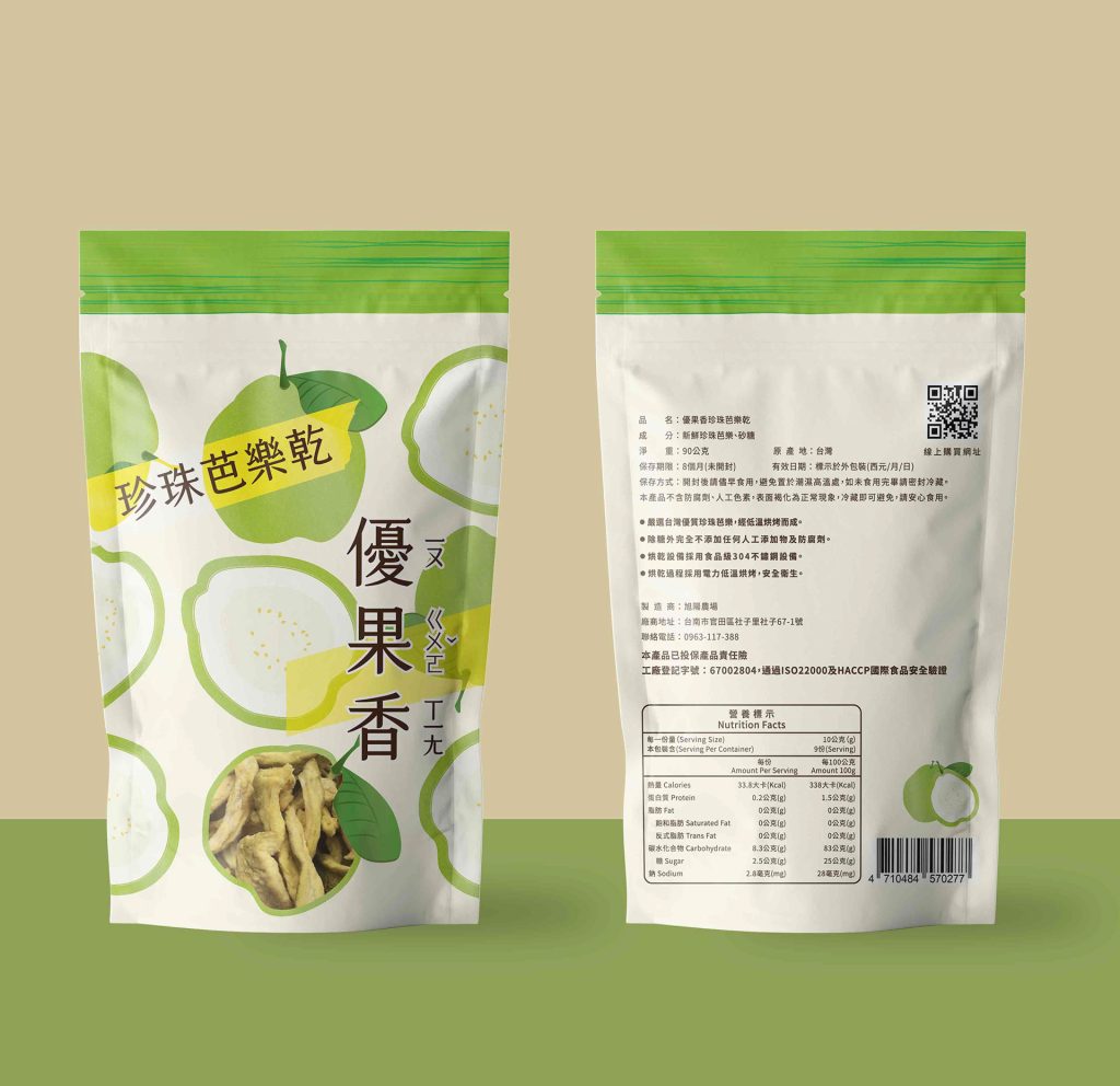
To support the rebranding of Xuyang Farm’s packaging, the visual identity draws inspiration from six featured dried fruits. Through hand-drawn food illustrations, both the exterior and interior textures of the fruits are captured, rendered in gradient colors that transition from unripe to ripe. Transparent windows on the packaging allow customers to see the freshness inside, as if experiencing the fruits’ journey of growth from the very first touch.
The vibrant, colorful palette reflects the brand’s vitality, like the rising sun of Xuyang, leaving a sunny impression on customers. After tasting the delicious products, they experience both surprise and joy, creating a double delight—visually and gastronomically.
為協助小農品牌旭陽農場進行包裝重新設計,作品視覺取自六種主打水果果乾,藉由繪製食品插圖,擷取水果外觀與內部果肉形狀,由青澀至成熟的漸層顏色,再藉由包裝上透明的開口,讓客戶能夠看見新鮮食物的本體,意即從接觸包裝即感受到水果的成長旅程。豐富繽紛的色彩,宛若品牌旭陽升起的盎然生機意象,亦給客戶留下陽光形象,並在味蕾享受到美味食品後,感受驚艷與喜悅,形成視覺上與味覺上的雙重享受。
–
Type Packaging design
Client Xuyang Farm
Designer Adeiv Tsai
Illustration Adeiv Tsai
Year 2021
分類 包裝設計
客戶 旭陽農場
設計師 Adeiv Tsai
插畫 Adeiv Tsai
年份 2021
Client Xuyang Farm
Location Tainan, Taiwan
Designer Adeiv Tsai
Illustration Adeiv Tsai
Image Mockup Adeiv Tsai